


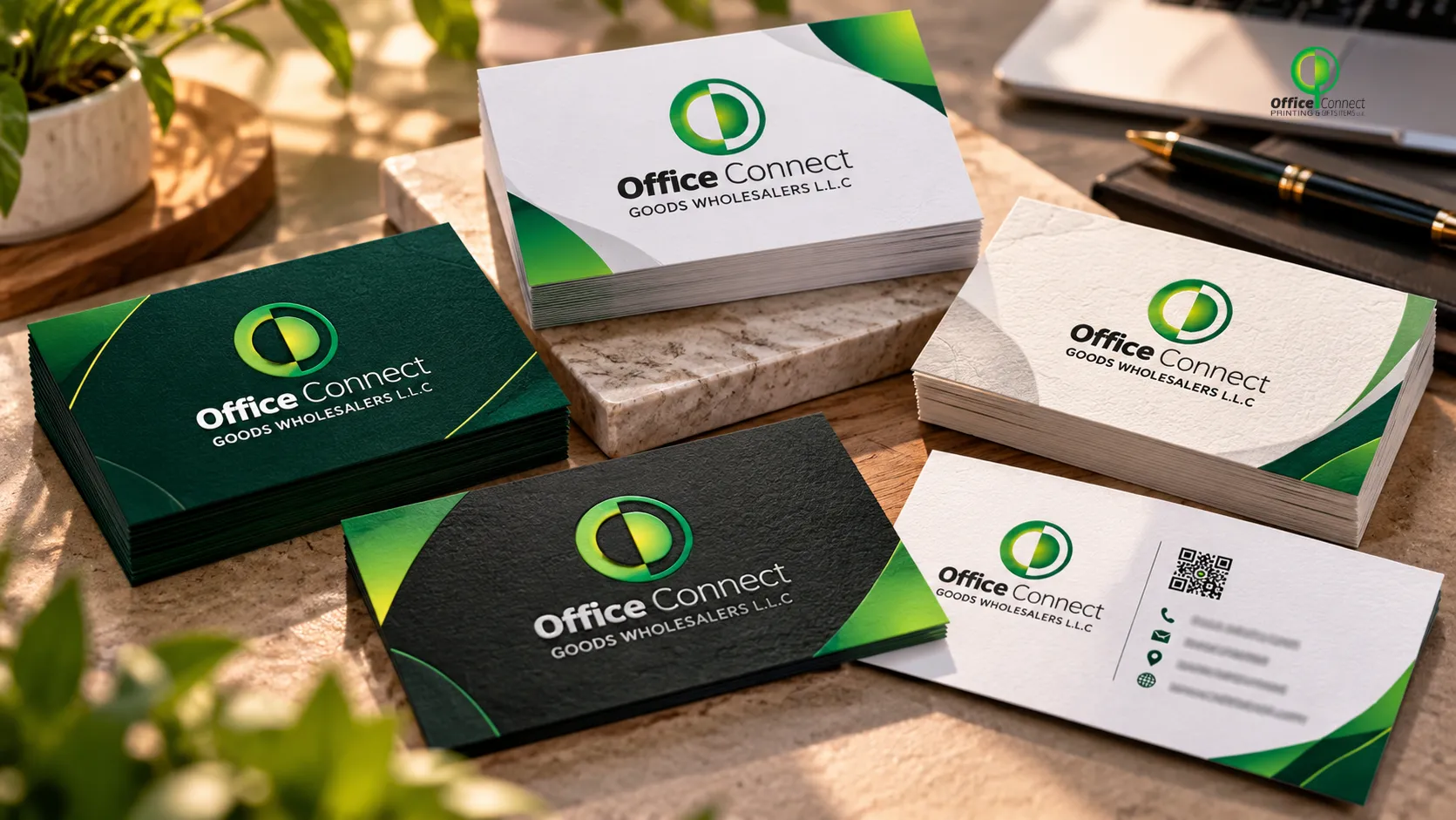
Most business cards end up in the same place. A drawer, a pocket, or the bin on the way out of the building. That’s just how it goes for cards that look like every other card handed out that week. But every so often, someone gets a card that they actually keep, maybe even show someone else. That’s not luck. That’s usually a card that was thought through properly, from the paper it’s printed on to the finish that makes it feel different in someone’s hand.
We print a lot of business cards, and the ones that get remembered almost always have a few things in common. Here’s what actually makes the difference.
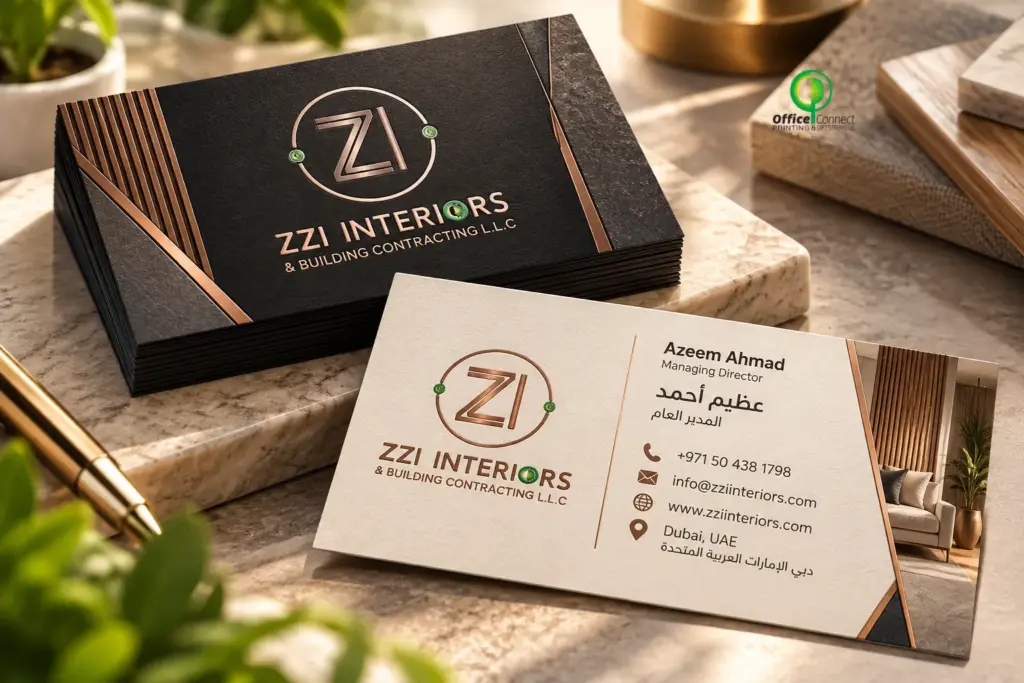 Standard stock (300-350gsm) is fine for everyday use but doesn’t stand out much. It’s the paper most cheap cards are printed on, which is exactly why it doesn’t get remembered.
Thick, premium stock (400gsm and above) feels noticeably more solid in hand. It’s a small difference, but people notice weight without necessarily knowing why.
Textured stock, like cotton or linen finishes, adds a tactile quality that plain smooth paper doesn’t have. It’s a subtle way to make a card feel more considered.
Recycled or uncoated stock works well for businesses that want to lean into a natural, eco-conscious brand image, and it’s becoming a more common request lately.
Finishes That Actually Make a Difference
Matte lamination gives a soft, non-glare finish that feels premium and doesn’t pick up fingerprints the way glossy cards do.
Spot UV adds a glossy raised effect on specific parts of the design, usually a logo or name, while the rest of the card stays matte. It’s a small detail, but it draws the eye exactly where you want it.
Foil stamping in gold, silver, or copper adds a genuine shine that catches light. This is one of the most requested finishes for businesses that want their card to look premium without overdoing the design itself.
Embossing or debossing raises or presses part of the design into the paper, giving it a textured, tactile quality that people notice the moment they pick up the card.
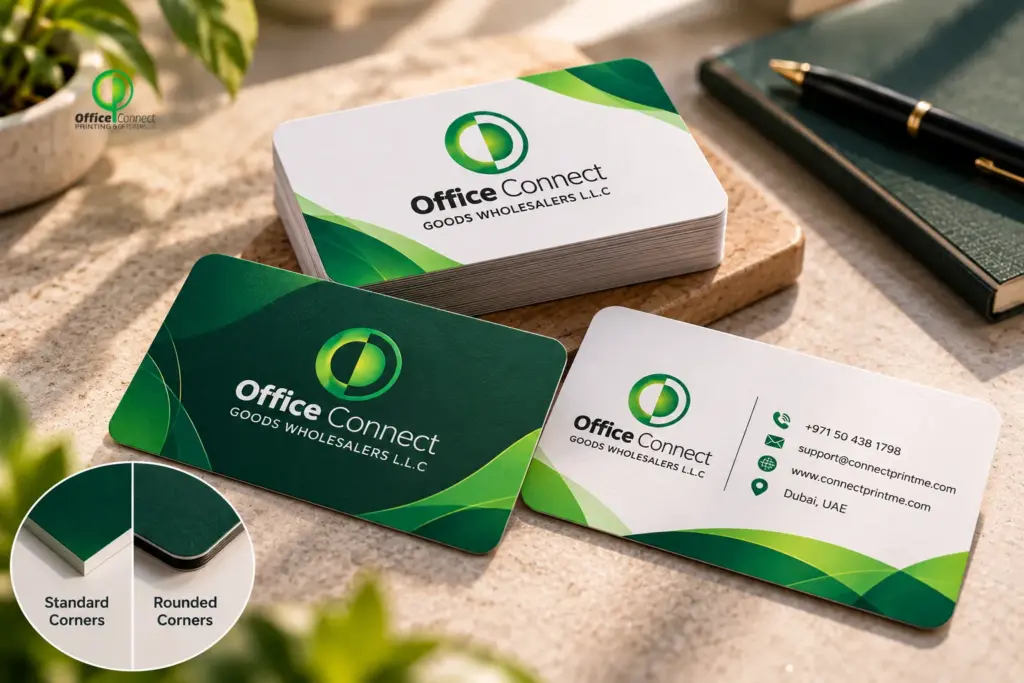
Rounded corners are a small change, but they make a card feel softer and slightly more modern compared to the standard sharp-edged look.
Why the Card Still Matters
In a city like Dubai where everyone’s networking, at events, meetings, conferences, a business card is often the only physical thing someone walks away with from meeting you. A weak, flimsy card sends a message, even if it’s not the one you intended. A well-made one does the opposite. It makes people assume the business behind it is just as put together.Paper Stock: The Part Most People Skip Over
The paper is the first thing someone feels before they even look at the design, and it matters more than most people realise.
Standard stock (300-350gsm) is fine for everyday use but doesn’t stand out much. It’s the paper most cheap cards are printed on, which is exactly why it doesn’t get remembered.
Thick, premium stock (400gsm and above) feels noticeably more solid in hand. It’s a small difference, but people notice weight without necessarily knowing why.
Textured stock, like cotton or linen finishes, adds a tactile quality that plain smooth paper doesn’t have. It’s a subtle way to make a card feel more considered.
Recycled or uncoated stock works well for businesses that want to lean into a natural, eco-conscious brand image, and it’s becoming a more common request lately.
Finishes That Actually Make a Difference
Matte lamination gives a soft, non-glare finish that feels premium and doesn’t pick up fingerprints the way glossy cards do.
Spot UV adds a glossy raised effect on specific parts of the design, usually a logo or name, while the rest of the card stays matte. It’s a small detail, but it draws the eye exactly where you want it.
Foil stamping in gold, silver, or copper adds a genuine shine that catches light. This is one of the most requested finishes for businesses that want their card to look premium without overdoing the design itself.
Embossing or debossing raises or presses part of the design into the paper, giving it a textured, tactile quality that people notice the moment they pick up the card.
Rounded corners are a small change, but they make a card feel softer and slightly more modern compared to the standard sharp-edged look.